Tattoo Shading: Creating Form, Texture, and Atmosphere
Discover how contrast, lighting, and selective texture give tattoo shading purpose and depth.
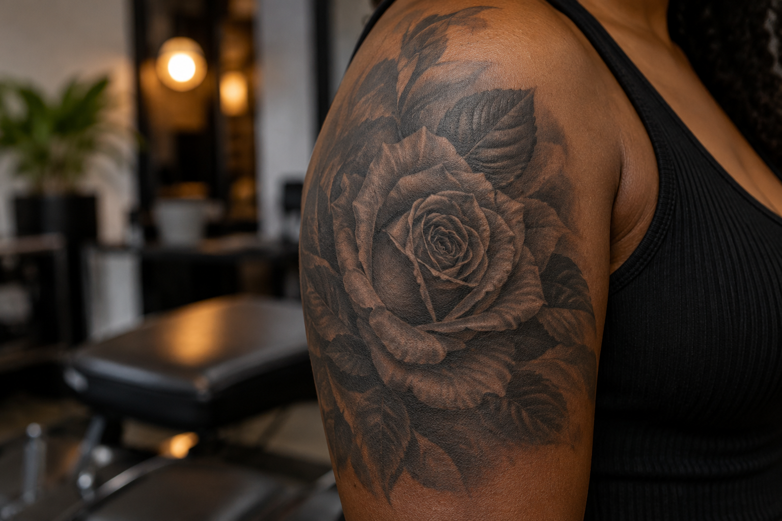
Shading is more than filling space
Shading can suggest volume, separate overlapping forms, establish a mood, or guide the eye. A dark background and a shaded face do different jobs even when both use similar tones. Before considering how smooth or textured the shading should appear, ask what the composition needs. Every shaded passage should contribute to the image rather than simply occupy an empty area.
Use a consistent lighting idea
A clear lighting direction helps the viewer interpret three-dimensional form. If a face is lit from the left, its major shadows should relate to that decision. Stylized designs may simplify or exaggerate the light, but their choices still benefit from consistency. Combining reference photographs without considering their lighting can create confusion even when individual sections look convincingly detailed.
Separate form from texture
Form describes the larger shape of an object; texture describes its surface. A shaded sphere can feel solid without elaborate texture, while detailed fur can look flat if the larger light and shadow relationships are missing. Artists often establish those broad relationships first. When comparing portfolios, step back from the fine marks and notice whether the subject’s overall volume is understandable.
Contrast builds a focal point
The strongest contrast does not have to appear everywhere. Concentrating darker shadows and lighter openings near a face or central motif can attract attention. Quieter areas give that focal point room to work. Ask where the artist intends the viewer to look first. A piece with equally dramatic contrast in every corner may feel energetic but less organized than one with a clear hierarchy.
Smoothness is a style choice
Some tattoos use soft-looking gradients; others feature visible dots, hatching, or deliberately graphic shadow shapes. Evaluate each approach in relation to its intended style. A textured illustrative tattoo should not be judged solely by the standards of photographic realism. Healed examples and naturally lit photographs can help you understand the actual visual effect without relying on dramatic edits.
Discuss the result, not a formula
Bring references for atmosphere, contrast, and texture, and explain what you like about them. Ask whether your chosen subject has enough space for the proposed shading approach. Avoid assuming that a technique name guarantees quality. A well-shaded tattoo connects its tonal choices to the design’s purpose, making the subject clearer and the composition more expressive.