Color Theory for Tattoos: Building a Palette with Purpose
Explore how hue, value, saturation, and surrounding skin influence a tattoo's visual palette.
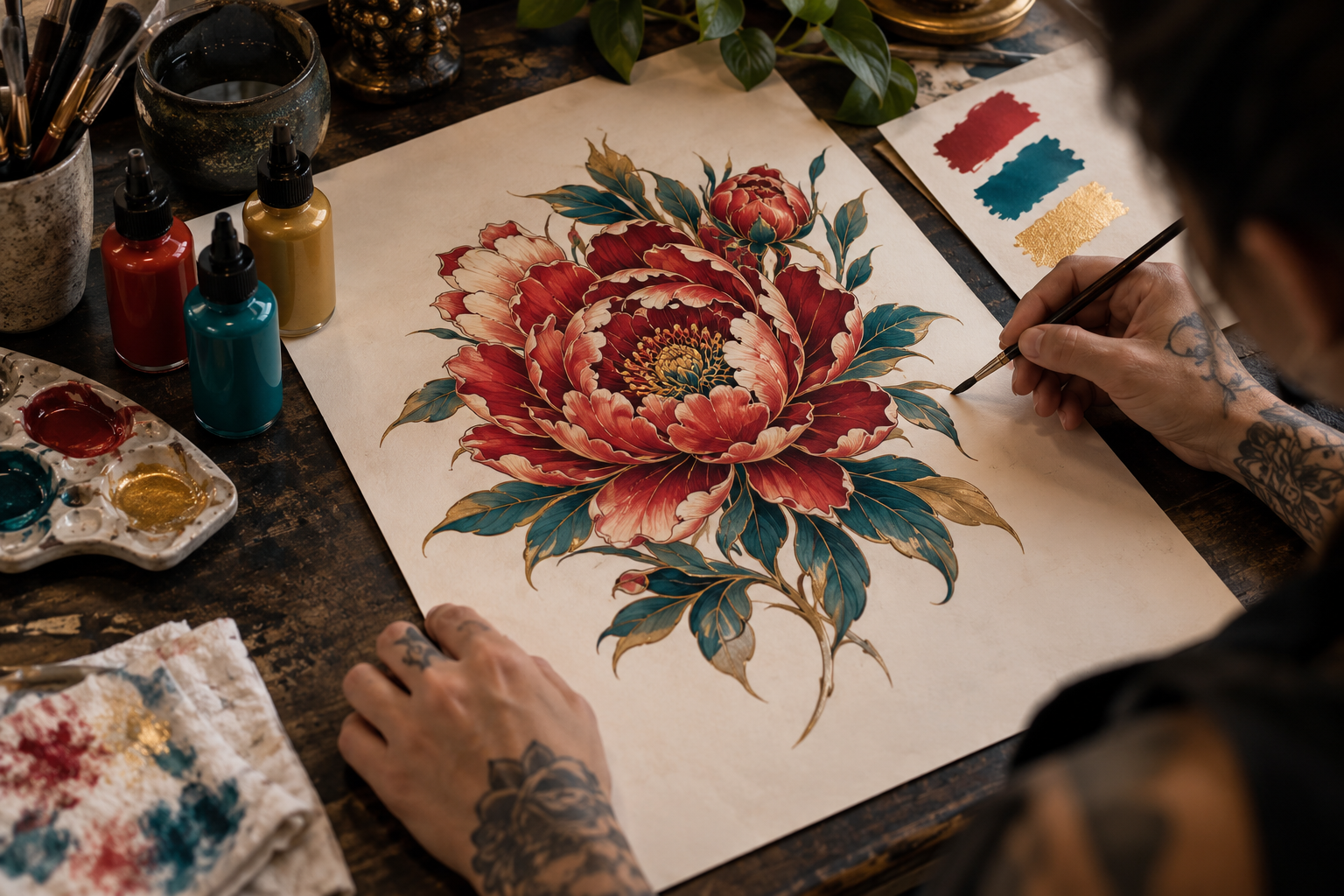
Color works through relationships
A tattoo palette is more than a list of favorite colors. Each hue is perceived alongside neighboring pigment, visible skin, and the design’s dark and light areas. A vivid red may dominate a muted composition but become less noticeable among several equally bright colors. Start by deciding what the palette should communicate: warmth, drama, softness, contrast, or a particular visual tradition.
Value keeps the design readable
Color can distract from the underlying pattern of light and dark. Two different hues may have similar values and appear less distinct than expected when placed next to each other. An artist can adjust outlines, shadow, or spacing to separate them. Ask whether the main forms remain understandable without relying entirely on hue differences. A clear value structure supports the palette rather than competing with it.
Saturation establishes emphasis
Highly saturated accents can attract attention, especially against more muted surroundings. Using the brightest color everywhere removes that advantage. An artist might reserve it for a flower, a face, or a small detail that carries the main idea. Describe the overall mood you want and discuss where visual emphasis should fall. More saturated pigment is not automatically the right answer for every part of a composition.
Skin is part of the palette
Tattoo color is viewed through and alongside the person’s skin, not against the white background of a drawing app. Ask to see the artist’s healed work on a range of skin tones, especially examples relevant to you. Avoid simplistic claims that particular people cannot wear color. The productive conversation considers contrast, palette choice, design scale, and the artist’s demonstrated experience.
Keep the number of decisions manageable
A focused palette can connect several elements into one composition. Too many unrelated hues may make a tattoo feel assembled rather than designed. Collect references for atmosphere and identify two or three important color relationships instead of requiring every favorite shade. Let the artist propose variations that keep the subject clear. The final palette should belong to the artwork as a whole.
Plan for a real tattoo
Printed swatches and digital previews are communication tools, not guarantees of an exact healed color match. Discuss how the artist expects the palette to read and ask for examples of similar work. Be cautious about universal promises concerning permanent brightness or identical results. Good color planning combines an expressive goal with practical visual judgment, allowing contrast and composition to do as much work as pigment.