Tattoo Linework: How Visual Structure Shapes the Design
Understand line hierarchy, contour, rhythm, and spacing without reducing tattoo craftsmanship to a single technique.
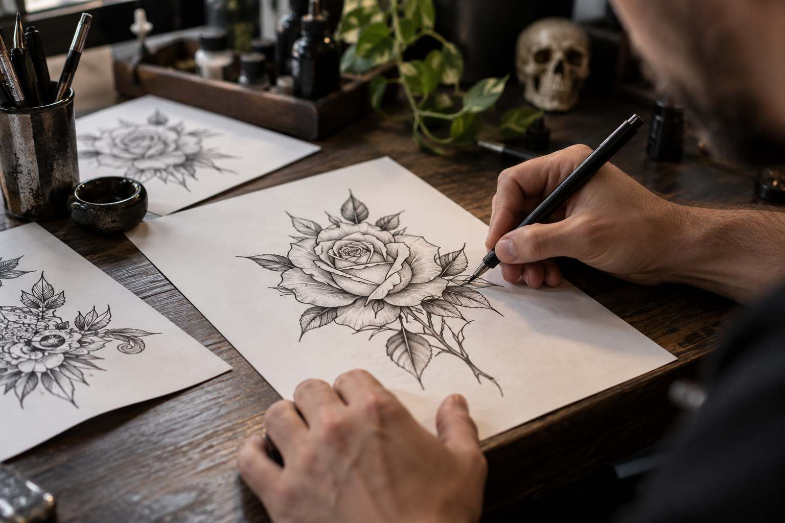
Lines create the image’s framework
Linework establishes boundaries, movement, and relationships between forms. In some styles it is the main visual feature; in others it quietly supports shading and color. A line is not judged only by thickness. Its direction, continuity, weight, and role inside the composition determine whether it helps the viewer understand the design. Strong linework begins with a clear reason for each mark.
Different lines have different jobs
An outer contour can establish the silhouette, while interior lines describe smaller structures. A heavier line may pull a form forward; a lighter one may suggest a secondary texture. Some styles rely on relatively uniform lines, while others use noticeable variation. Neither choice is automatically superior. The relevant question is whether the line hierarchy matches the design’s visual language.
Rhythm connects neighboring forms
Repeated curves can guide the eye through a flower, animal, or ornamental pattern. Abrupt changes in direction can create energy, but they can also interrupt an otherwise flowing composition. When reviewing a drawing, trace its major paths with your eye. If the marks lead naturally between important features, the artwork often feels more coherent before any shading or color is added.
Spacing is part of line quality
Lines that sit too close together can compete with one another at the intended tattoo size. An artist may open gaps, remove interior details, or adjust a contour to improve readability. Those choices are part of craftsmanship, not separate compromises. Review the design at actual scale and ask which marks are essential. Enlarged digital previews can make dense areas look more forgiving than they will on skin.
Reading a portfolio
Look for consistent visual intention across complete pieces, not just isolated close-ups. A drawing that feels purposeful can contain different line characters in different areas. Healed examples offer another perspective on the relationship between lines and surrounding skin. Ask how the artist adapts the design to curved placement. A clean flat drawing still needs judgment to become a successful tattoo.
What a client can contribute
You do not need to prescribe equipment settings or application methods. Explain whether you want a bold, delicate, textured, or graphic appearance, and bring references that communicate that preference. Let the artist connect those goals with a suitable design. The most productive discussion focuses on visual outcomes: clear contours, comfortable spacing, and a composition that makes sense from more than one viewpoint.